Friday 29 November 2013

Because it's 'Ebay Rare'.


'Ebay rare'


adjective, e·bay rar·er, e·bay rarest.

1.
Item for sale online that has been described as 'rare' that the seller has made no attempt to verify if it is or is not, and is largely a commonplace item. 
2.
An item being sold online, or talked about online that a person wishes to imply has greater desirability or value than it actually does, and thus describes it as 'rare'. 
3.
An item someone has acquired that is a commonplace item that they found hard to get hold of quickly, due to the item no longer being manufactured and few or no owners were at the time selling second hand across the world.
4.
Something that someone is going to be, or thinking of taking to an antique appraiser to find out 'what it is worth' - after they saw one on ebay sell for "Squllions". 

Rare you say? I guess those prices are cheap then!  


It seems that if something has been hard to get for a person, then it somehow becomes 'rare'. Rare is often equated to meaning 'valuable' in collector-speak, but in reality this isn't actually true about such items. 

A friend of mine used to run a record store that specialised in hard to find recordings. I used to hang out in his shop from time to time to just talk, and listen to whatever interesting stuff he used to find. He once ran a radio program on Triple Z FM (radio) called 'Galactic Zoo'. 

It wasn't unusual for people to come in off the street and sell him interesting recordings that they had, or to ask him advice on the value of various recordings in their collection. On a near daily basis someone would come by to tell him that they had a copy of 'The Beatles: Sgt. Pepper's Lonely Hearts Club Band' on vinyl, and they wanted to know what it was worth. 

For those that aren't aware, that album in vinyl form sold 40 million copies, and has been re-released several times over. It is one of the greatest selling LPs ever. 

He was always polite when he answered the question, and pointed out to them that it was essentially valueless, except for the first pressing run version. They would almost invariable ask 'How much for the first pressing', and then be disappointed that it was pretty much the same as what you pay for the modern CD brand new. 

Pop onto Ebay now and it isn't hard to find people selling copies an exorbitant rates. They aren't selling, but it seems to perpetuate the idea that the recordings are worth something. Despite there being 40 million of the things out there, I personally don't see many of them about the place. Even on ebay there's more novelty items related to the album than there are actual copies. 

Friday 22 November 2013

Sunday 17 November 2013

When is an Olympia SM1 not an Olympia SM1?

The title of this post isn't some cryptic riddle. There's no prize to be given away to the person that gets it right, and I won't be asking anyone to turn their Facebook profile photo into a giraffe.

Some of you may recall the Olympia SM1 that I purchased over at Woolloongabba antiques earlier this year that I promptly set about removing a layer of filth from its shell. Well, I dropped that typewriter to John Lavery who gave it a final fixing and fine-tuning for me (thank you very much John!) which subsequently led me to developing a short lived secret and financially unhealthy obsession with Olympia typewriters.


The SM 1, or as some like to call it - the Olympia SM, sort of feels like an unfinished re-design of the original Olympia Progress typewriter. However has bucket-loads of charm and style and is still a very appearing machine. 


Other than the oddly obvious screws on the side of the typewriter, the SM is quite a polished and distinctive machine. It is very well made, and is excellent to type on.

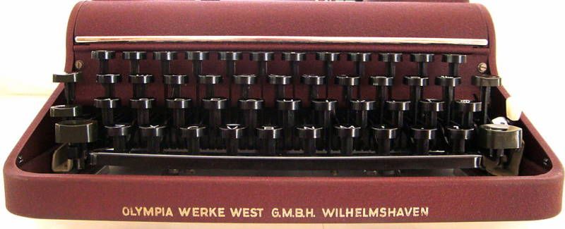
So surprised by the quality of the early Olympias, I soon found myself looking for other Olympias of more developed years on ebay. This was a short lived obsession that culminated in the purchase of a maroon machine that I spotted on German ebay.

I contacted Peter Muckermann and he kindly agreed to forward the machine onto me (danke Peter!). After a few weeks I had in my hands a gorgeous Olympia in the colour that Olympia does so well.


The typewriter unfortunately came loose in its case during transit. But as a testament to the quality of the construction of these typewriters, the machine sustained no damage other than a miss-placed escapement release bar. 

On the other hand, the clips the held the typewriter in the case were substantially bent, including the thick steel support rods located at the top of the case. These took some real effort to get back into place, and I can only conclude that the typewriter copped a hell of a knock in transit. 


But I was so pleased to have this beautiful typewriter in my possession that I really didn't worry too much about what had happened to it. Hey, it is usually nice to have something to fix.

But there was something strange about this typewriter. Something... didn't feel the same when I tried to type on it. While the paint was the same crinkle paint as my other SM, it was a very glossy crinkle paint that was quite different to my other machine that was Matte.

Over all, it just didn't.... feel.... the same typewriter. It didn't type worse, it just typed differently. It was a bit dirty, so I couldn't tell if it was faster or slower as yet but there was definitely something different about the keys.

I looked closer and discovered something that I wasn't expecting. Looking at the photos above I'm sure some keen eyed members of the typospherian will no doubt spot something a little bit different to the normal SM1 labelling. But if you didn't, here's a closer look.


As opposed to:

Photo: VintageTypewriterJewellery.com


Orbis? Who is this..... Orbis... 

The back of the typewriter was also quite revealing. Whereas the label on the back usually has the very familiar cursive 'Olympia' logo, this machine instead has 'Orbis' in its place. 


Other than the glossy crinkle paint, there were also some other substantially more significant differences between the machines. 

Firstly, the two typewriters have different platen knobs. The plastic on the maroon typewriter felt and looked different to the larger, but less well-made versions featured on my SM1. 


The Maroon typewriter has quite a different case, which is colour-matched to the machine. 


Also, the maroon version of this machine has a significantly different keyboard.


As you can see, they keys on the maroon machine are significantly thicker, and have a sharper edge around the ring. My original SM1 has keys that are identical to the older Progess/Simplex/Elite machines from prior to WW2.

The differences between the keys aren't cosmetic either. You may also be able to see that the metal tabs under the keys that slot perpendicularly to the type lever don't extend as far down as they do on the SM1. As it turns out the keys on the Maroon machine are a lot more complicated. They have several interlocking parts, and appear to facilitate the keys to spring, like what we are more familiar with on the SM3 and 4 machines. The keys themselves feel oddly weighted compared to the SM1.

Naturally my first response was to jam 'Orbis' into google to find out what on earth I had in my hands.

Unfortunately very little came up. And what did come up was a confusing mix of bit-parts. So I promptly hopped onto email and messaged the most knowledgable guy that I know, that probably isn't going to have a problem with me late-night work-fatigued lack of english language skills.

So I emailed Rob Messenger.

Rob didn't have a lot, but he had some interesting things to say about 'Orbis'. Between Rob and the other sources that I consulted, I eventually got a very vague picture about the history of this typewriter.

After WW2 the bulk of the Olympia design and engineering workers managed to have somehow gotten themselves over the border from East Germany and into the more business capital orientated West. Here they began to set up a new company to begin building typewriters again.

However, they appear to have faced a few barriers. Firstly, they had no money. They attempted to extract the capital that was related to the original Olympia interests in East Germany, but were reportedly thwarted at the last step. Secondly there was a tussle over who had the rights to use the 'Olympia' name. As such 'Orbis' was born. Orbis was a name that had been associated with the company before.

While the legal fight went on, the company started to produce typewriters. However the company must have seized control of the name early in manufacturing, and as such The machines ended up being badged 'Olympia'.

On the East German side Optima was formed, and they used existing designs to construct Olympia machines.

However the paper table gives away something about the history of the maroon machine. The 'Olympia' badge sits in an oddly recessed shape on the paper table, that looks like it is some kind of slot in plate. While I was doing some investigation into the 'Orbis', I found this photograph on Pinterest.

Photo: The Typewriter Workshop. 

This machine features the same carriage lever, keys, rubber feet and paper stand from the pre-WW2 machines, while it has the later crinkle paint, and at least 1 of the chrome strips. Note that the badge does not sit in a recessed section on the paper-table.

If you look at the typewriter database there is an Orbis model listed which was made for approximately a year - around 1949. This machine was reportedly over-engineered and significantly more costly than the prevailing SM1.

I don't have a lot of information about this era of machine, and a such it is open to conjecture about what machine is what. This becomes even more complicated when you discover 'Olympia  model Orbis' machines being advertised several years after the 1 year manufacturing period of the 'Orbis'.

From the 'Sydney Morning Herald' in March 1951. Similar ads featured in the newspaper until late 1952. The 'Royal Easter Show' is a large rural fair that occurs in Sydney every year. 

The machine in this photo appears - with a bit if eye-straining, to have the same platen knobs of the SM1, and the same keys. It is possible however that this is largely a over-stock line that was expensive and hard to sell in Sydney at the time before, they started selling SM labelled machines. But that is pure speculation. 


So, very little is clear about this maroon machine. But that doesn't detract from me enjoying it. Then again, I have suddenly found myself with a handful of Olympias, all of which are magnificent machines. 

But more about that later.... 

Thursday 14 November 2013

Mum, the typosphere is in the letterbox again!


It is storm season again here in Queensland,  and we've had storms every night this week so far. This photo above was taken with my phone about 40 minutes ago, as I am waiting for this storm to hit and probably knock out the power for the evening. It won't be long till I'm back to blogging by candlelight again.

That said, I feel for the people who have suffered from the intense storms in the Philippines. The tragedy I have been watching on through the news has been almost unbelievable. I wish such news wasn't just played out for our entertainment value though. I wish I could jump on a plane and help the cleanup in the same way as I did after the floods here in Bris, but alas I think more boots on the ground like mine would just contribute to the problems they are having there.

However in other news, I've received some great items from the Typosphere lately.


Firstly, there's this wonderful envelope with some beautiful stamps, and a great little caption. There is also the familiar typeface of an Olivetti Graphika on the address label. 

It is of course from Richard Polt. The man that owns the Monarch 101 typewriter that I so unfortunately lust after, and the man that 'powers the typosphere'. With all that running that he does, I'm surprised he has time to write with his typewriters! 

Anyhow, I loved the stamps affixed to the front. 


I used to collect stamps once. It was one collection hobby that I haven't continued, but I still appreciate a beautiful stamp. 


Inside was the auction catalogue that I had quizzically 'won' from Richard's blog recently, along with a postcard. I just noticed the date of the auction, and I clearly need to get my butt into order if I'm going to bid on something!

But I also got something else from the typosphere that was supposed to be in my letterbox, but wasn't.


Rob Bowker will probably recognise this letter... sort of. You see, I used to have my paypal delivery address set to my old office that I use to work in. I stupidly had this set as default through paypal, but the Ebay default that I usually use paypal with, was to my actual home address.

As such I just assumed this letter would be heading home, and not to an address that I was no longer located at.

Subsequently, various departments at work bounced this envelope around in the internal mail for quite some time - each time adding a new location to the address line, until someone just got too lazy and instead propped the envelope against a whiteboard in a department that I occasionally wander into.

I currently work for three departments on separate days, so it was somewhat understandable that this could happen.

I eventually walked into the room where the envelope was propped, and after a few moments of surprised confusion after seeing my name on the envelope I excitedly picked it up and remembered that I what it was.


Tuh-dah! Post cards! 


Oh, I do love the stamps from the UK. So many variations on the one theme, but they are often beautifully presented. 


Right, now I had better remove that address from my Paypal. God knows what else I have bought that has gone to the wrong location. 


As you can see from this photo, the storm is really rolling in now. This snap was taken with my iPhone on the front deck about 2 minutes ago. You can JUST see the crack of lightening in this shot horizontal on the middle of the photo.

Dwayne, Burst mode on your iPhone 5s is your friend. (hold just hold your finger on the button). 

Thursday 7 November 2013

So, tell me about this Carina 2 typewriter.


The Carina 2 is a very solid typewriter despite the plastic case, but is very light despite its size. Even when it is being kept in its interesting case. 


Tuesday 5 November 2013

Art, love and Robert Clinch

This is a continuation of the typecasts of my trip to Melbourne.


Arthur Streeton: A golden summer. 


Jeffrey Smart: The Listeners.


A quick photo I took of one of Robert's sculptures. Note the corresponding painting in the background. 

Robert Clinch: Dovetailed


Robert Clinch: Fanfare for the common man. 


Robert Clinch: Spartacus

I went to high school in Essendon, and in Melbourne the your team is often your tribe. The Essendon colours are etched permanently in my mind - despite being a Fitzroy supporter. 


Robert Clinch: Sign of the times.
The very familiar (to Melbournians) Nylex sign, and 'Skipping girl Vinegar' signs have been 'Coked'. 


The Nylex sign

Skipping girl vinegar

The subject of why these ageing signs are so loved by Melbournians is an entire blog post on its own.


Robert Clinch: Lot's Wife.

Robert Clinch: Soliloquy.

Robert Clinch: Bull Bar.

Robert Clinch: From bauhaus to our house.

Robert Clinch: Loch Ness.

I really love Robert's sense of humour. 


Just for reference, I don't have permission to post the images of those artworks that are displayed above. They are linked directly to Robert's website, which can be found HERE. Please, pop over and by his book (or even a painting?) so that he feels the exposure has been worth it to him and as such won't ask me to stop displaying his works.

Meanwhile, if you're ever in near somewhere his paintings are on display, GO SEE THEM. The pictures on here just don't do them justice at all.